
Build a three-layer customer service dashboard that tracks real-time operations, weekly performance, and monthly strategy without overwhelming your support team.

Key takeaways
Most articles about customer service dashboards are written for someone who has never seen one.
Here's the honest diagnosis: most support dashboards fail not because they're missing metrics, but because of bad architecture decisions. We've seen teams tracking 40 KPIs simultaneously and still missing SLA breaches, because the two numbers that actually matter (FCR and queue wait-time) were buried three clicks deep. That's a design problem.
A great customer service dashboard isn't comprehensive. It's opinionated. It's built around three distinct layers, each serving a different purpose and a different audience. Build it that way, and the data finally starts driving real decisions instead of filling slides.
The typical dashboard build starts in the wrong place. A manager opens a new reporting tool, pulls in every available metric, and arranges them on a canvas. Two months later, the team has stopped looking at it.
The problem is that a dashboard built without a clear action protocol becomes noise. When every metric is visible, none of them are urgent. And when there's no owner assigned to a number, no one acts when it moves in the wrong direction.
There's also the vanity metric trap.
NPS, for example, looks important on a dashboard. But NPS reflects the entire customer relationship, not just support quality. Pinning it on your frontline team is unfair and misleading. Save NPS for monthly strategic reviews where it belongs, and get it off your real-time operations view entirely.
The fix is structural, not cosmetic. Before you choose a tool or design a layout, you need to decide what three questions your dashboard is answering.
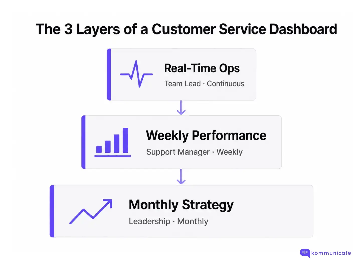
Think of your customer service dashboard not as a single screen, but as three distinct views stacked on top of each other. Each layer has a specific job.
This view answers: Is anything on fire right now?
It shows live queue depth, current wait time, agent availability, and active conversation count. The numbers update continuously. The audience is whoever is responsible for the next two hours of coverage. This layer should never have more than five metrics on it.
This view answers: How did we do this week, and where do we need to improve?
It shows first contact resolution rate, average handle time, CSAT trend, ticket volume by category, and escalation rate. Reviewed once a week in a structured team meeting, this layer drives coaching conversations and process improvements.
This view answers: Are we trending in the right direction, and what is it costing us?
It shows NPS trajectory, cost per ticket, agent utilization rate, and deflection rate if you're running AI or chatbot support. This is the layer you share with finance, product, and the C-suite. It should tell a story, not a spreadsheet.
Each layer requires different data refresh rates, different audiences, and different response protocols. Collapsing them into one view is the most common mistake we see, and the easiest one to fix.
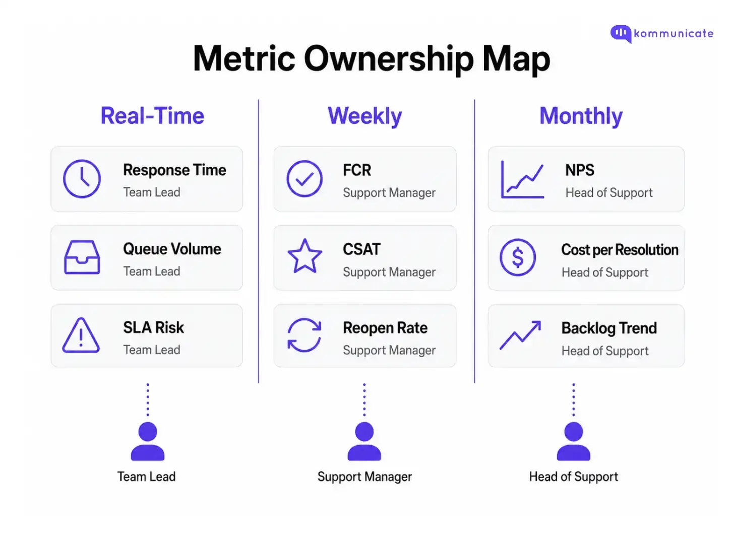
Infographic showing customer service dashboard metric ownership across three layers: real-time metrics like response time and SLA risk owned by team leads, weekly metrics like FCR and CSAT owned by support managers, and monthly metrics like NPS and cost per resolution owned by the head of support.
Once you've decided on your three layers, the metric selection becomes much simpler. The question for each metric is "which layer does it live in, and who is responsible when it drifts?"
For a deeper dive into how specific KPIs interconnect, the guide on customer support KPIs every team should track covers the full framework in detail.
Two quick opinions on this list.

Here's the decision sequence that actually matters: data sources first, visualization second. Most teams pick a beautiful dashboard tool and then discover their data is siloed and can't feed it cleanly.
Start by identifying your source of truth. For most support teams, that's your helpdesk (Zendesk, Freshdesk, Intercom, or Kommunicate's native dashboard). Your helpdesk should be the authoritative source for ticket volume, FCR, AHT, and queue metrics. If it can't produce those natively, that's a configuration problem to solve before you add a BI layer.
Then layer in your CSAT and CES collection tool. This can be native (most modern helpdesks include it) or a dedicated survey tool. The key is that survey responses flow back into the same reporting environment as your operational metrics; otherwise, you'll always be comparing data from different time windows manually.
For more sophisticated teams, the architecture options break down like this:
For most teams under 50 agents, the native helpdesk dashboard plus a dedicated CSAT tool gets you 80% of the way there. The BI layer is worth the investment when you need to combine support data with CRM or revenue data.
One integration mistake to avoid: don't pull data from too many sources without a single aggregation point. If your FCR lives in your helpdesk, your CSAT lives in a survey tool, and your NPS lives in a CRM, your dashboard becomes a manual reconciliation exercise. That's not a dashboard; that's a report you write yourself every week.
For a broader view of the metrics worth wiring up, the article on essential customer service metrics and what they signal covers measurement logic for both human and AI-assisted support teams.
Before you open any tool or write a single integration, we recommend filling out a simple planning worksheet. It forces the decisions that determine whether a dashboard will actually get used: which layer does this metric live in, who owns it, what's the red flag threshold, and what action does a breach trigger?
We've built a Dashboard Builder Worksheet you can use directly below. Fill it in for your team's three layers, assign owners, and set your thresholds before you touch the design.
The discipline of filling this out typically cuts the number of metrics teams end up tracking by half. That's a feature, not a bug.
A customer service dashboard is only as useful as the decisions it drives. The teams we've seen get the most out of theirs share one thing: they treat the dashboard as a decision-making system, not a reporting artifact. They've chosen fewer metrics, assigned clear owners, and built three distinct layers that serve different questions at different cadences. The result is a support operation that catches problems before customers feel them, and improves because the data actually connects to action. Start with the architecture, not the aesthetics.